From Album Art to Music Video: A Practical Guide to Album Cover Animation
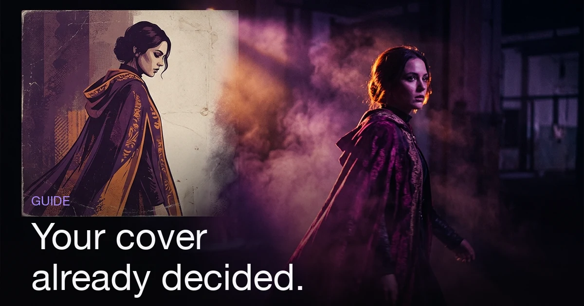
Your cover art has already settled most of the decisions a music video needs: a palette, a light direction, a subject, a setting and a texture. Turning it into moving picture means extracting those five things in words, then writing them into every shot description instead of starting from a blank page. Decide first whether you are animating the cover itself — one held image with subtle motion, which suits abstract and graphic sleeves — or building a world around it, where the cover becomes shot one and the video explores the place it implies. Most covers suit the second. Name the palette in colours rather than moods, name the light source and its direction, describe the subject the way a stranger would, and reuse the same reference image across every scene so the world holds. The honest limit: a flat illustration does not automatically become good motion, and cover typography rarely survives generation.
What does it take to turn album art into a music video?
The short answer: Your cover art has already settled most of the decisions a music video needs: a palette, a light direction, a subject, a setting and a texture. Turning it into moving picture means extracting those five things in words, then writing them into every shot description instead of starting from a blank page. Decide first whether you are animating the cover itself — one held image with subtle motion, which suits abstract and graphic sleeves — or building a world around it, where the cover becomes shot one and the video explores the place it implies. Most covers suit the second. Name the palette in colours rather than moods, name the light source and its direction, describe the subject the way a stranger would, and reuse the same reference image across every scene so the world holds. The honest limit: a flat illustration does not automatically become good motion, and cover typography rarely survives generation.
Most artists start a video the hard way: with a blank box and a question they have never been asked before — what should this song look like?
Which is strange, because they answered it three weeks ago. The cover art is finished. Somebody chose the colours, the light, the face, the world, the typeface, the amount of grain. Those choices were argued over, slept on, sent to two friends for an opinion. They are the most decided visual thing about the release, and then the video gets planned as though none of it happened.
This post is about not doing that. If you are still choosing a concept from scratch, our AI music video ideas guide is the place to start; this one assumes the concept already exists — it is sitting in a 3000×3000 JPEG in your distributor's upload form — and covers how to get it out of the image and into a set of shots.
What should you look for in your own cover?
Look at the sleeve as a brief rather than a picture. There are five things in it worth taking, and everything else is composition you should not try to repeat.
- Palette. Not "warm" — the actual colours. Two dominant hues and one accent, at most. If you cannot name them, sample them; a screenshot and a colour picker takes thirty seconds and gives you hex values you can translate into plain words.
- Light. Where does it come from, and how hard is it? One source or many? Is there a genuinely dark part of the frame, or is everything evenly lit? This single question separates a cover that will translate into video from one that will look flat the moment it moves.
- Subject. A person, an object, an animal, nothing. If it is a person, describe them the way a stranger describing a photo would — age, build, hair, one identifying garment.
- Setting. The place the image implies, including everything just outside the crop. A figure on wet pavement implies a street, weather, time of night, a city that has streetlights of that colour.
- Texture. Film grain, halation, print stock, digital cleanliness, painted brushwork, screenprint flatness. This is the element artists forget, and it is what makes a video feel like it belongs to the sleeve rather than merely sharing its colours.
Write those five down before you open anything. Five lines, plain language, no adjectives you would find on a mood board. That page is your brief, and it is a better one than most people write from scratch — because it describes something that already exists rather than something you are imagining.
Animate the cover, or build a world around it?
These are two different products, and picking the wrong one is the most common mistake here.
Animating the cover means the artwork stays, roughly, the artwork: one composition, subtle motion, a loop. It is honest for a short placement — a Canvas-style loop, a story post, a pre-save asset. It gets tired fast because a single composition has one thing to say and says it in about eight seconds.
Building a world around it means the cover becomes shot one, or the reference the shots obey, and the video moves through the place the cover implies. This is what people usually mean when they say they want to turn their cover into a video, and it is the version that can survive three minutes.
| If your cover is… | Do this | Because |
|---|---|---|
| A photograph of a person | Build a world | The subject can walk, turn, arrive somewhere — a held portrait exhausts itself in seconds |
| An abstract or graphic design | Animate it, and loop it | There is no subject to follow; the motion is the piece |
| Typography-led | Build a world, keep the real type as an overlay | Generated lettering is unreliable; your designed lockup is not |
| A detailed illustration | Build a world in the illustration's style | Motion applied inside one static illustration reveals every stiff joint |
| One striking object | Either — open on the object, then widen | The object is a strong shot one, and the world behind it is unwritten |
A useful test: cover the top and bottom of your cover with your thumbs so you are looking at a widescreen strip. If the image still works, you have a frame. If it collapses, you have a poster — which is not a criticism of the artwork, it just means the video needs to be built around the cover rather than out of it.
How do you turn cover elements into shot descriptions?
This is the actual work, and it is a translation exercise. Take a hypothetical sleeve: a woman in a red wool coat on wet pavement under one sodium streetlight, everything else close to black, heavy grain.
| Element | On the cover | Written as a shot instruction |
|---|---|---|
| Palette | Sodium orange, near-black, one red | "Sodium-orange light, near-black surroundings, the red coat as the only saturated colour in frame" |
| Light | One hard source, overhead, steep falloff | "Single hard overhead source from camera-left, face half in shadow, background two stops darker" |
| Subject | Woman, mid-20s, dark bob, red wool coat | "Woman, mid-twenties, dark chin-length bob, red wool coat" — plus the cover image itself as a reference |
| Setting | Wet city pavement, night, no landmarks | "Wet asphalt reflecting the streetlight, anonymous city street, no signage or recognisable buildings" |
| Texture | Heavy grain, halation around the light | "35mm grain, halation blooming around light sources" |
Now you have five clauses, and every shot in the video gets all five. The shot that changes is the action — she arrives, she waits, she looks up, a car passes, the street empties. The look stays nailed down.
That repetition is the point, and it is the part people skip because it feels redundant. It is not: consistency between shots is what makes a set of frames read as one video rather than a compilation, which is the mechanism our guide to what makes a music video look cinematic goes into in detail. A cover-derived palette repeated across eight shots does more for coherence than any single impressive frame.
Two things to resist:
- Adjectives that describe your feelings about the cover. "Melancholy", "raw", "ethereal" are not executable. "One light source, everything else black" is.
- Reproducing the composition every time. Same rules, different frames. If shot four is shot one again from slightly further back, you have made a slideshow. (If a slideshow is genuinely what you want, there is a right way to build one.)
Where the cover goes in the workflow
Two places, and they do different jobs.
As words, in your first message. In Melodious, attaching a song and describing what you want in a single message is enough to get a storyboard and the keyframe images for it in the same run — there is no interview and no length picker to get through first. That makes what you write in that message load-bearing: it is where the look is decided. Which is exactly why the five extracted lines are worth writing down before you type anything. "Sodium-orange light, near-black surroundings, one red coat, wet anonymous street at night, 35mm grain" is a first message that produces a storyboard already in your release's world. "Moody video for my new single" is not.
The cost of that first run is shown under the composer before you send it, so you can see what the storyboard-and-keyframes stage will take. The video render is a separate, explicit approval — nothing renders because you sent a chat message.
As an image, as a reference. Melodious has an assets library: you can save an image as a Character, Style, Location or Prop, give it a short written brief, and then pull it into any project by typing @. A saved visual asset adds its image as a reference on the shots it touches and appends a consistency note to your prompt, which biases the generation toward that look rather than re-inventing one. Saving your cover — or the character from it — as a Style or Character asset means the same reference is available on every project for the release, not just this video. You can run up to 14 reference images at once — four character references for likeness, plus ten object or style references — and all of them are applied to every scene in the storyboard, so a character asset and a style asset reinforce each other rather than competing for one slot.
Worth being clear about what this does and does not do: attaching the cover conditions the images strongly, it does not clamp them. Frames still drift. The workflow that actually holds up is: describe the five elements in words and attach the reference and read the storyboard against the cover before you approve the render, regenerating any single keyframe that has wandered out of the palette. Individual keyframes regenerate on their own without touching the rest.
If the subject on your cover is a person who needs to appear in every scene, that is a slightly bigger job than a style reference — reusable AI characters covers keeping one face across a whole video.
Keeping the release visually coherent
The video is not the last asset you will cut from this. A single release usually needs the sleeve, the video, a vertical edit, a square crop and a handful of stills — and coherence across all of them is what makes a release look like a release rather than five separate jobs.
The cover is the anchor for all of it, but the shapes fight each other. Covers are square. Video is widescreen. Short-form is vertical. A composition that works at 1:1 will lose its edges at 16:9 and its sides at 9:16, so the framing has to be planned for the crops you know are coming rather than fixed afterwards — our aspect ratio guide has the actual dimensions per platform.
Three habits that carry the look across all of it:
- Lock the palette once, apply it everywhere. The same two-plus-one colours in the sleeve, the video, the thumbnails and the announcement graphics. This is the cheapest coherence there is.
- Frame with the vertical crop in mind. Keep the subject and the meaningful action inside the middle third on shots you know will be cut for Reels or Shorts, so the vertical version is a crop rather than a re-shoot.
- Keep one recurring element. A colour, a garment, an object, a light. It only takes one thing repeating for a viewer to connect the video back to the sleeve.
Done properly, this is the visual half of a release campaign — the single release workflow covers the timing side, and if you are building something that persists past one song, building an artist persona with AI video is about making these decisions once and reusing them across every release.
What can't your cover art do for you?
Being straight about the limits, because this technique is oversold:
- A static illustration does not automatically become good motion. Illustration is composed to be still — the pose is held, the composition is balanced for a single read. Motion applied to it tends to reveal how much of that stillness was load-bearing. Generating new footage in the illustration's style usually beats animating the illustration itself.
- Typography rarely survives. Generated lettering is inconsistent, and your wordmark is a designed object with kerning someone was paid to worry about. Keep it as a real overlay on top of generated footage.
- A low-resolution or heavily-compressed cover is a weak reference. If all you have is the 640px version off a streaming page, it will condition toward mush. Use the master.
- Faces from artwork are harder than faces from photographs. A stylised or painted face gives a model less to hold on to than a photo does. If the cover subject is you, a set of real reference photos will hold the likeness better than the painted version of you.
- A cover with no light logic gives you nothing to extend. Flat, evenly-lit artwork translates into flat, evenly-lit footage, which is the single most reliable signature of amateur video. If your sleeve has no shadow side, decide on a light direction for the video and add it — the cover does not have to be the whole brief.
Common mistakes
| Mistake | What it produces | Do instead |
|---|---|---|
| Attaching the cover and writing nothing | Generic footage with roughly the right colours | Attach it and write the five lines |
| Describing the cover in moods | Unexecutable brief; every shot interprets it differently | Colours, light direction, subject, setting, texture |
| Reproducing the composition each shot | A slideshow of one image | Same rules, new framings and moments |
| Letting the palette drift after shot three | The video stops matching the release | Repeat the palette clause in every scene description |
| Animating a portrait sleeve directly | Eight interesting seconds, then nothing | Build a world; make the cover shot one |
| Asking the model to redraw your title type | Wobbly, wrong-kerned lettering | Overlay the real lockup |
| Framing only for 16:9 | Vertical crops lose the subject | Compose the important third for both |
Start with the five lines
If you take one thing from this: before you open anything, write down your cover's palette, light direction, subject, setting and texture in five plain sentences. That page is a better creative brief than most videos get, it took ten minutes, and the decisions in it were already made and already approved by the people whose opinion you trust.
Then use it twice — as the words in your first message, and as the reference image attached alongside them. The cover stops being a thing you made for the release and starts being the thing the release is made from.
If you have not settled on the look at all yet, work backwards from how to choose a visual style first, then come back and write the five lines.
Frequently asked questions
What is album cover animation?
Album cover animation is turning a static sleeve into moving picture — either by animating the artwork itself (subtle motion on a single held image, the format Spotify Canvas popularised) or by using the cover as the visual brief for a full video, where its palette, light and subject define every shot. The second is what most artists actually want: the cover becomes shot one and the video explores the world it implies, rather than the same image gently drifting for three minutes.
Can I turn my album cover into a music video?
Yes, but rarely by animating the cover file alone. A single image has one composition, and motion applied to it exhausts itself in about eight seconds. The reliable route is to read the cover for its reusable elements — palette, light direction, subject, setting, texture — describe those in concrete words, and build a set of shots that all obey them. The video then looks like it came from the same release as the cover, which is the actual goal.
How do I describe my cover art so an AI can use it?
Name colours instead of moods ("sodium orange and near-black with one red accent", not "warm and moody"), name the light source and where it comes from ("one hard overhead source, camera-left, background two stops down"), describe the subject the way a stranger would ("woman, mid-twenties, dark bob, red wool coat"), and name the texture ("35mm grain, halation around lights"). Those four lines are worth more than any adjective.
Should my music video look exactly like my album cover?
It should share the cover's rules, not repeat its composition. Same palette, same light logic, same subject, same texture — different framings, locations and moments. A video that reproduces the sleeve over and over reads as a screensaver; one that obeys the same constraints reads as the same body of work, which is what makes a release feel coherent across the sleeve, the video and the social crops.
What if my cover is abstract or typographic?
Abstract and graphic sleeves are the ones genuinely worth animating directly — there is no subject to follow, so a looping motion piece is the honest format, and it suits short-form placements. Typography is the harder case: generated type is unreliable, so keep your real title lockup as a designed overlay and let the generated footage carry the imagery underneath it rather than asking a model to redraw your wordmark.
Does the cover art guarantee my video will match it?
No — it strongly biases the result rather than guaranteeing it. Attaching your cover as a reference image conditions the keyframes toward its look, and repeating the palette and light in every scene description reinforces that, but generated frames still drift. Expect to regenerate individual keyframes that break the look, and check the whole storyboard against the cover before you approve the video render.
Your cover already wrote half the brief
Attach the song, describe the cover in colours and light rather than moods, and Melodious writes the storyboard and generates your keyframes in the same run.
Start from your cover