How to Make a Music Visualizer: Three Routes, Including Code
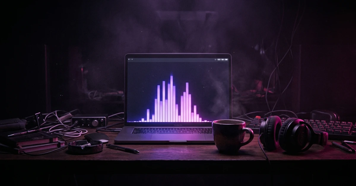
There are three ways to make a music visualizer. The fastest is a browser tool: load an audio file, pick a style, record the canvas as it plays, and download a video — about four minutes plus the length of the song. The most controllable is desktop software, which renders offline instead of in real time and can composite the visualizer over other footage. The most flexible is writing it yourself with the Web Audio API, which takes roughly forty lines: create an AudioContext, connect an AnalyserNode to the audio source, call getByteFrequencyData on every animation frame, and draw the resulting array to a canvas. Whichever route you take, the picture is driven by the same two numbers: loudness and how energy is spread across frequencies. A visualizer is enough to give a track something to show; a single you are promoting is better served by a music video.
Plans from $29/month, cancel anytime. Starter makes one 30-second video a month.
The short answer: There are three ways to make a music visualizer. The fastest is a browser tool: load an audio file, pick a style, record the canvas as it plays, and download a video — about four minutes plus the length of the song. The most controllable is desktop software, which renders offline instead of in real time and can composite the visualizer over other footage. The most flexible is writing it yourself with the Web Audio API, which takes roughly forty lines: create an AudioContext, connect an AnalyserNode to the audio source, call getByteFrequencyData on every animation frame, and draw the resulting array to a canvas. Whichever route you take, the picture is driven by the same two numbers: loudness and how energy is spread across frequencies. A visualizer is enough to give a track something to show; a single you are promoting is better served by a music video.
What are you making this for?
Almost nobody wants a visualizer for its own sake. You want something to upload to YouTube, or a moving picture for a song on a streaming page. Start there, because it decides how much effort a visualizer deserves.
A visualizer is the right call for catalog tracks, beats, demos and anything that only needs to not look empty. It is generated from the audio, so you can do an entire back catalog in an afternoon, and that is exactly what the three routes below are for.
It is the wrong call for the one release you are actually promoting. A spectrum carries no subject, so it gives a new listener nothing to remember or share, and every track run through the same template looks like the last. For that track, a music video with a place, a person and a point of view is the better use of the same upload slot. Music video vs music visualizer lays out the comparison in full.
The two are not exclusive: many artists give the album tracks a visualizer and the single a video.
Route one: a browser tool, four minutes
If you need a file to upload today, stop reading after this section.
Our audio visualizer takes four steps: load your track, pick bars, waveform or a radial spectrum, press Record, download. No account, no watermark, and the audio never leaves your device — the analysis and the recording both happen locally.
Two honest constraints. Recording is real time, because the browser captures the canvas as it plays; a three-minute song takes three minutes and the tab has to stay in the foreground. And the output in most browsers is WebM. YouTube accepts WebM directly, so a YouTube upload is finished at that point. Instagram and TikTok want MP4 or MOV, and that step is a real re-encode from VP9/Opus to H.264/AAC, not a container relabel — a few minutes in HandBrake or FFmpeg, and invisible at a sensible bitrate. If your source is a phone recording or a studio bounce, the same browser engine has pages for M4A to MP4 and WAV to MP4, and the sound wave generator draws a plain waveform instead of bars.
The longer walkthrough, and what "free" tends to mean in tools that are not browser-based, is in free music visualizer.
Route two: desktop software, a weekend
Desktop tools earn their weight in two places. They render offline, so a ten-minute track does not cost ten minutes of watching a progress bar. And they let the visualizer be a layer instead of the whole frame — over footage, over artwork, masked into a logo, with the reactive element doing 20% of the work instead of 100%.
That second point is the real argument for them. A full-screen spectrum is a look nobody chose; a spectrum as a thin reacting line under a still image is a design decision. If you already own a video editor, check whether it has an audio-reactive or "audio-driven" parameter before buying anything new — most modern editors can drive a property from an audio track's amplitude, which is enough for a pulse.
Route three: write it yourself
This is the part no competing guide bothers with, and it is shorter than people expect.
The Web Audio API gives you an AnalyserNode that sits in the audio graph and hands you a snapshot of the sound whenever you ask. You ask once per animation frame and draw the result.
<input type="file" accept="audio/*" id="file">
<audio id="audio" controls></audio>
<canvas id="canvas" width="1280" height="720"></canvas>
<script>
const audio  = document.getElementById("audio");
const canvas = document.getElementById("canvas");
const ctx2d  = canvas.getContext("2d");
let analyser, bins;

document.getElementById("file").onchange = (e) => {
  audio.src = URL.createObjectURL(e.target.files[0]);

  // One AudioContext, created on a user gesture. A media element can only be
  // wired into the graph once, so guard against doing it twice.
  if (!analyser) {
    const ac = new AudioContext();
    analyser = ac.createAnalyser();
    analyser.fftSize = 2048;              // default; 1024 bins out
    analyser.smoothingTimeConstant = 0.8; // default; lower = twitchier
    ac.createMediaElementSource(audio).connect(analyser);
    analyser.connect(ac.destination);     // or you hear nothing
    bins = new Uint8Array(analyser.frequencyBinCount);
    draw();
  }
  audio.play();
};

function draw() {
  requestAnimationFrame(draw);
  analyser.getByteFrequencyData(bins);   // 0..255 per bin

  const { width: w, height: h } = canvas;
  ctx2d.fillStyle = "#140b1f";
  ctx2d.fillRect(0, 0, w, h);

  // Only the bottom ~55% of the spectrum carries anything musical.
  const useful = Math.floor(bins.length * 0.55);
  const bars   = 48;
  const per    = useful / bars;
  const slot   = w / bars;

  ctx2d.fillStyle = "#c084fc";
  for (let i = 0; i < bars; i++) {
    let peak = 0;                        // peak, not average — averages mush
    for (let j = Math.floor(i * per); j < (i + 1) * per; j++) {
      if (bins[j] > peak) peak = bins[j];
    }
    const barH = (peak / 255) * h * 0.82;
    ctx2d.fillRect(i * slot + slot * 0.2, h - barH, slot * 0.6, barH);
  }
}
</script>
Paste that into an HTML file, open it, choose an MP3. That is a working music visualizer.
The four things in there that are not obvious
analyser.connect(ac.destination). Route the analyser onward to the speakers or you get a silent, perfectly animated canvas. It is the single most common first bug.
frequencyBinCount is fftSize / 2. At the default fftSize of 2048 that is 1024 bins, which is far more than you can draw. Bucketing to 48 bars is not a shortcut, it is the display decision.
Take each bucket's peak, not its mean. Averaging a bucket that contains one loud bin and eleven quiet ones flattens the loud one into nothing, and the whole display sags toward the middle.
The top of the spectrum is empty. The bins run linearly to half the sample rate, so on a 44.1kHz file the upper half covers about 11–22kHz. Draw all of it and half the canvas is a flat line on even the loudest master. The 0.55 above is the fix, and it is the biggest single visual improvement available.
One knob worth playing with: smoothingTimeConstant defaults to 0.8, which averages each frame against the last. Drop it toward 0.4 and the bars snap; push it toward 0.95 and they drift. Most homemade visualizers that feel wrong are at the wrong end of that one number, not badly drawn.
Driving something other than bar height
Once the array is in your hands, bars are only the most literal thing you can do with it. The upgrade that makes a homemade visualizer stop looking homemade is to stop feeding the whole spectrum into one shape and start picking bands out of it.
Sum roughly the first eight bins and you have a number that tracks the low end — kick, sub, the floor tom. Drive a scale, a flash, a camera push or a background shift from that alone and the visual starts landing on the beat instead of shimmering continuously. Take a slice from the upper-middle of the useful range and you have something that tracks hi-hats and consonants, which is good for grain, sparkle or jitter. Two bands driving two unrelated properties reads as a designed reaction; one band driving everything reads as a level meter.
The waveform array is the other half of the toolkit. getByteTimeDomainData returns the raw signal centred on 128, not frequency energy, which is why an oscilloscope line has to be mapped to -1..1 around the middle of the canvas, not up from the bottom — get that wrong and the line sits jammed against the top edge, a bug that looks like a rendering fault and is arithmetic.
Saving it as a video
A canvas that only exists while the page is open is not an upload. canvas.captureStream(30) gives you a 30fps video track; combine it with an audio track from a MediaStreamAudioDestinationNode and feed both to a MediaRecorder, and you get a file with sound in it.
This records in real time — there is no fast-forwarding a live capture — which is exactly the constraint the browser tools carry too. Rendering faster than real time means encoding offline, which in a browser means shipping a full encoder into the page.
Which route should you actually take?
Use a tool if the job is to give a track a surface so it can exist on YouTube or in a feed. Use code if you want a look nobody else has, or if the visualizer needs to live inside something you are already building.
If the track is a single you are pushing to playlists, press or ads, a spectrum will never get there, because it cannot show a place, a person or a story. For that one, make a video. In Melodious you attach the song and describe what you want to see in one message; it analyzes the song's structure, writes the storyboard and generates the keyframes in the same run, and you approve the video render as a separate step after seeing them. How to make an AI music video walks through it, and music video vs music visualizer is the comparison that decides between the two.
Pick a visualizer for the album tracks, start your video in Melodious for the single, and keep the audio visualizer bookmarked for the rest.
Frequently asked questions
What is the fastest way to make a music visualizer?
A browser tool. There is nothing to install and no account: you load the file, choose a style, and record. Budget the length of the song plus a few minutes, because browser recording captures the canvas as it plays, and cannot run faster than real time. The output is usually WebM, which YouTube accepts directly.
Do I need to code to make a music visualizer?
No, and most people should not. Coding one is worth doing when you want a look that no template offers, when you want the visuals driven by something specific in the track and not the whole spectrum, or when the visualizer needs to live inside a page or an app you are already building. For a release-day upload, a tool is the correct answer.
What does the Web Audio API actually give you?
An AnalyserNode, which hands you a snapshot of the sound on demand. getByteFrequencyData fills an array with the energy in each frequency bin, 0 to 255, and getByteTimeDomainData fills one with the raw waveform samples centred on 128. Everything you have ever seen in a visualizer is a drawing of one of those two arrays.
How many bars should a spectrum visualizer have?
Fewer than the analyser gives you. At the default fftSize of 2048 you get 1024 bins, which is far more than a screen can usefully show — a 1280px canvas would give each bar barely a pixel. Group them into 32 to 72 buckets, taking each bucket's peak, and the display becomes readable without losing the shape.
Why does my visualizer look dead on the right-hand side?
Because the bins are spaced linearly all the way to half the sample rate. On a 44.1kHz file the upper half of the array covers roughly 11–22kHz, where recorded music carries almost nothing, so half your canvas is a flat line even on a loud track. Drop the top of the range and only draw the lower portion.
Can a visualizer react to just the drums?
Yes, and it is the single best upgrade to a homemade one. Sum the first handful of bins — the low end, roughly the kick — into one number and drive a scale or a flash from it, instead of driving everything from the whole spectrum at once. It turns a graph into something that feels like it is listening.
A visualizer reacts to the sound. A music video shows something.
If this track is the one you are pushing, attach it and say what you want to see. Melodious writes the storyboard and generates the keyframes in the same run, so you see the whole video before you decide to render.
Storyboard your song