Audio Spectrum Visualizer: What the Bars Are Actually Showing
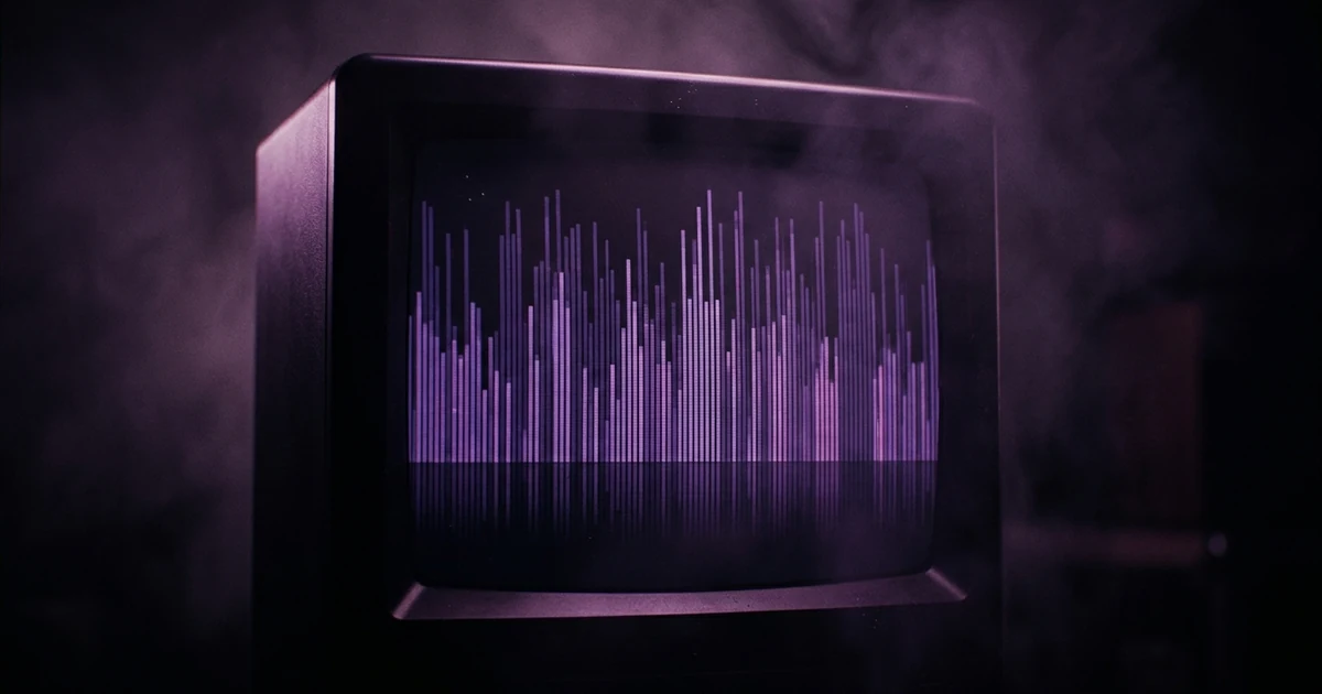
An audio spectrum visualizer displays how a sound's energy is distributed across frequency at one instant. It works by taking a short window of audio — a few tens of milliseconds — and running a Fast Fourier Transform over it, which converts that slice from a list of samples over time into a list of energy levels per frequency band. Each band is a bin, and each bar you see is one bin or a group of them. In the Web Audio API the bins are spaced evenly from 0Hz up to half the sample rate, so on a 44.1kHz file the array covers 0 to 22,050Hz in equal steps. That even spacing is why the right-hand half of most spectrum displays looks dead: almost no recorded music carries energy above 11kHz.
The short answer: An audio spectrum visualizer displays how a sound's energy is distributed across frequency at one instant. It works by taking a short window of audio — a few tens of milliseconds — and running a Fast Fourier Transform over it, which converts that slice from a list of samples over time into a list of energy levels per frequency band. Each band is a bin, and each bar you see is one bin or a group of them. In the Web Audio API the bins are spaced evenly from 0Hz up to half the sample rate, so on a 44.1kHz file the array covers 0 to 22,050Hz in equal steps. That even spacing is why the right-hand half of most spectrum displays looks dead: almost no recorded music carries energy above 11kHz.
From a wiggle to a bar chart
Digital audio arrives as one number after another: the position of a speaker cone, sampled 44,100 times a second. That sequence is a picture of time. It says nothing directly about frequency — the bass note and the hi-hat are summed into the same single value.
A Fourier transform separates them. Give it a short window of samples and it returns the amount of energy at each of a set of frequencies, which is the same slice of sound re-described as a recipe of ingredients instead of a movement over time. The Fast Fourier Transform is the algorithm that does this cheaply enough to run sixty times a second on a phone.
That is the entire trick. A spectrum visualizer runs an FFT over the last few tens of milliseconds of audio, gets back an array, and draws it as bars. Particles, geometry and colour cycling are all presentation on top of that same array — the point what is a visualizer makes a level up. To build one instead of understanding one, how to make a music visualizer has the code.
Bins, and the resolution trade you cannot escape
The FFT does not report a continuous curve. It divides the range into equal-width bands — bins — and gives one number per bin.
How many, and how wide, follows from one setting. In the Web Audio API the AnalyserNode has an fftSize, which must be a power of two between 32 and 32,768 and defaults to 2048. You get frequencyBinCount bins, which is always half the FFT size, spread linearly from 0Hz to half the sample rate.
Work the numbers for the default on a CD-rate file:
| fftSize | 2048 samples |
| Bins out | 1024 |
| Range covered | 0 – 22,050Hz |
| Width of one bin | ≈ 21.5Hz |
| Length of the analysed window | ≈ 46ms |
Now the trade. Doubling fftSize to 4096 halves the bin width to about 10.8Hz, which is a finer frequency picture — but it also doubles the window to roughly 93ms, so the analyser is describing a longer smear of time and fast transients blur into it. Halve it to 1024 and the display gets snappy and coarse. There is no setting that is precise in both time and frequency at once. Finer frequency resolution requires a longer window, and a longer window is by definition a blurrier moment — this is a property of the transform itself, not a limitation of the browser. 2048 is the default because it sits near the useful middle for music.
Why is half of your spectrum display always dead?
Bins are spaced linearly. Human hearing is not.
We hear pitch logarithmically: an octave is a doubling. The octave from 55Hz to 110Hz — the bottom of a bass guitar — sounds like the same musical distance as the octave from 3,520Hz to 7,040Hz. On a linear axis at 21.5Hz per bin, the first octave occupies about two and a half bins. The second occupies about 164.
So a faithful linear plot spends three-quarters of its width on the top two octaves — 5,512Hz upward — where recorded music carries cymbal shimmer, air and little else, and crushes everything a listener would call a note into the leftmost sliver. That is the whole explanation for the two things people notice first about homemade spectrum visualizers: the right half never moves, and the interesting part is a jammed-together stripe at the far left.
Tools handle this in one of two ways. The quick fix is to throw the top away and draw only the lower 50–60% of the array; our own audio visualizer does exactly that, and it is the single largest visual improvement available for one line of code. The proper fix is to re-bucket onto a logarithmic axis, giving each octave equal width — which is what every analyser in mixing software does, and why those look so different from browser visualizers.
The vertical axis is decibels, not loudness
The other axis is easy to misread. getByteFrequencyData returns integers from 0 to 255, and those are not a linear measure of energy — they are decibel values, mapped onto the byte range between the analyser's minDecibels and maxDecibels.
Decibels are logarithmic too, and deliberately so: it takes a very large change in actual signal power to move a bar a visible amount at the top of its range. The practical consequence is that a bar at 200 is not "twice as loud" as one at 100, and comparing bar heights across a track tells you far less than it appears to.
The floor matters as well. Everything quieter than minDecibels clamps to zero, so lowering it drags noise and reverb tails up into the display and the whole thing looks busier. Raising it produces a clean display that hides the quiet detail. Neither is more correct; both are a decision about what you want visible.
Why do the bars glide instead of flickering?
Real audio, analysed 60 times a second, is violent. Bin values leap around frame to frame, and a raw plot strobes unpleasantly.
One setting is responsible for the glide: smoothingTimeConstant, which defaults to 0.8 and averages each frame against the previous one. Nothing else in the analyser smooths anything over time.
That default is heavier than most people realise. At 0.8 you are looking at a rolling average, not at this instant — which is why a spectrum can look like it is lagging slightly behind a sharp kick. Drop it to 0.4 for something percussive and the display starts hitting on the beat. It is the most consequential single number in a spectrum visualizer and almost nobody touches it.
A second mechanism is often confused with it and does something different. Before each transform the analyser applies a Blackman window to the block, tapering the sample window's edges so a note that happens to start mid-block does not smear its energy across every bin. That cleans up each individual frame; it does not connect one frame to the next.
Spectrum, waveform, oscilloscope, spectrogram
Four displays get confused with each other, and the difference is which axes they use.
Spectrum. Frequency across, energy up, one instant. What is this sound made of, right now.
Waveform. Time across, amplitude up. How loud, and when. No frequency information whatsoever — a bass note and a cymbal of the same loudness draw the same shape. This is the display you see in an editing timeline.
Oscilloscope. The same time-versus-amplitude data as a waveform, drawn live and continuously, not laid out for a whole file. In the Web Audio API it comes from getByteTimeDomainData, whose values are centred on 128, which is why an oscilloscope line has to be drawn around the middle of the canvas instead of up from the bottom.
Spectrogram. Time across, frequency up, energy as colour. A stack of spectra over time, and the only one of the four that shows you structure — you can see a snare, a vocal formant, a fade.
Most "audio spectrum visualizers" sold as video templates are the first, occasionally the second, and never the fourth.
Where this stops being useful
A spectrum is an honest picture of a sound and a poor picture of a song. It will always be in time with the music and it will never be about anything — two different tracks through the same template produce two videos that look essentially alike, and no palette fixes that. What is a visualizer covers where the format earns its place, free music visualizer is the practical how-to, and music video vs music visualizer is the comparison to read before you decide a spectrum is what your release needs. If it is not, how to make an AI music video is the format that can be.
Frequently asked questions
What does an audio spectrum visualizer measure?
Energy per frequency band at a moment in time. A tall bar on the left means the sound currently carries a lot of low-frequency energy — a kick drum, a bass note. A tall bar on the right means high-frequency energy — a hi-hat, sibilance in a vocal. The bar heights say nothing about pitch names, notes or key; they are a physical measurement of where the energy sits.
What is an FFT bin?
One frequency band in the analyser's output. The Fast Fourier Transform divides the range from 0Hz to half the sample rate into equal-width bands and reports the energy in each. The width of one bin is the sample rate divided by the FFT size — at 44,100Hz with an FFT size of 2048, each bin is about 21.5Hz wide, and there are 1024 of them.
Why does the right half of the spectrum look empty?
Because the bins are linear and music is not. Half of a 44.1kHz analyser's bins cover 11,025Hz to 22,050Hz, a region carrying cymbal shimmer and air and very little else. Half the display is spent on the least eventful octave in the file, which is why most visualizers quietly discard the top of the range before drawing.
What is the difference between linear and logarithmic frequency scale?
Linear gives every hertz the same width; logarithmic gives every octave the same width. Human pitch perception is logarithmic — the octave from 55Hz to 110Hz sounds like the same distance as 3,520Hz to 7,040Hz — but on a linear axis the first occupies about 2.5 bins and the second about 164. A log axis is why analysers in mixing software look so different from browser toy visualizers.
What is the difference between a spectrum and a waveform?
A spectrum shows one instant broken down by frequency; a waveform shows loudness over time with no frequency information at all. They answer different questions: the spectrum says what the sound is made of right now, the waveform says how loud it was and when. A spectrogram is the third option, plotting frequency against time with energy as colour.
Why do the bars move so smoothly?
Because the analyser averages each frame against the previous one. In the Web Audio API this is the smoothingTimeConstant, which defaults to 0.8 — heavy smoothing. It is a display choice, not a property of the audio: set it to 0 and the same track produces a violently flickering display that is technically more honest and much harder to look at.
A spectrum is a picture of the sound. A music video is a picture of something.
Attach your track and say what you want to see. Melodious writes the storyboard and generates the keyframes in the same run, so you see the whole thing before deciding to render.
Storyboard your song