Album Cover Ideas: Six Approaches and What Each One Signals
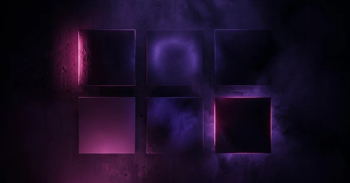
Album cover ideas fall into about six approaches, and each one tells a listener something before they press play. A portrait signals that the artist is the subject. An object signals a concept album with a controlling idea. Typography signals confidence and genre allegiance. Abstraction signals mood over narrative and suits instrumental and electronic work. A photograph signals a real place and time. An illustration signals a built world with its own rules. Choose the approach first and the image second — most bad covers are the right image executed in the wrong approach for the record.
The short answer: Album cover ideas fall into about six approaches, and each one tells a listener something before they press play. A portrait signals that the artist is the subject. An object signals a concept album with a controlling idea. Typography signals confidence and genre allegiance. Abstraction signals mood over narrative and suits instrumental and electronic work. A photograph signals a real place and time. An illustration signals a built world with its own rules. Choose the approach first and the image second — most bad covers are the right image executed in the wrong approach for the record.
Lists of cover "ideas" usually hand you a pile of suggestions — neon, a desert, a mirror, hands — with no way to tell which one belongs on your record. The suggestions are not the hard part. The hard part is that a cover is a claim about what kind of record this is, made in a square that most people will see the size of a postage stamp, and the claim has to be true.
So this is organised by approach. Six of them, what each signals, and the specific way each one fails. This page is about choosing the direction; once you have, how to make an album cover covers the process of building it, and the same palette and light decisions go straight into a music video afterwards.
1. The portrait
What it signals: the artist is the subject. The record is a person, and following it means following them.
This is the default in pop, hip-hop, singer-songwriter and anything built on a persona, and the reason is straightforward: a face is the most legible object a human being can be shown. It reads at any size, it carries emotion without explanation, and it does the work of building an artist persona across a whole catalogue.
Where it fails: when the record has a controlling idea bigger than the performer. A face pulls every scrap of attention toward the person in it, so a concept album with a portrait on the front announces itself as a personal record and then isn't one. It also fails when the portrait is just a good photo of you with no decision behind it — a well-lit press shot is a press shot, and putting it in a square does not make it a sleeve. The fix is usually a decision imposed on the image: one hard light, one colour, one gesture, one thing wrong.
2. The object
What it signals: there is a controlling idea, and this thing is it.
A single object on a plain field is the most compositionally efficient cover there is. It survives every crop, it reads small, and it invites interpretation without demanding it. Pink Floyd's The Dark Side of the Moon is the extreme version — the object reduced all the way to a diagram — and it is why the format recurs across genres that otherwise share nothing. There are more worked examples in famous album covers.
Where it fails: when the object is arbitrary. An object cover makes an implicit promise that the thing means something, and a listener who plays the record and finds no connection registers the cover as decoration. It also fails when the object is over-styled — the moment it looks like a product shot, the record reads as a product. Keep the lighting closer to a still life than a catalogue.
3. The typographic cover
What it signals: confidence, and a genre allegiance. Type alone says the music does not need an image to sell it.
Purely typographic sleeves are common in punk, techno, jazz reissues and anything with a design-literate audience, because the typeface itself carries enormous information. A condensed grotesque, a blackletter, a wonky hand-drawn wordmark and a plain system font are four different genres before a single word is read. Reid Miles's Blue Note sleeves are the reference case: type, crop and a tight palette doing the work illustration does elsewhere.
Where it fails: at thumbnail size, more often than any other approach. Type that fills the frame survives; type set small in a corner becomes grey mush in a queue. It also fails when the typeface is doing an impression — a genre's house style used without a reason reads as costume. And it is the approach with the least margin for amateur execution, because everyone can see when kerning is wrong even if they cannot name it.
4. The abstract cover
What it signals: mood over narrative. There is no story here; there is a temperature.
Gradients, fields of colour, generated forms, texture, light. This is the natural home of instrumental, ambient, electronic and experimental music, and it is the approach that translates best into motion later — abstraction has no subject to fall out of sync, which is exactly why it works in the Spotify Canvas slot too.
Where it fails: when it is indistinguishable from every other abstract cover. This approach has the lowest floor and the highest ceiling: a specific abstraction — one palette, one form, one texture you could describe to someone over the phone — is unforgettable, while a generic one is wallpaper. If you cannot describe your abstract cover in a sentence that would exclude other people's, it is not finished.
5. The photograph
What it signals: this happened. A real place, a real moment, a documentary claim.
Landscape, street, interior, a room after everyone left. Photography grounds a record in a specific world, and it carries the incidental detail — weather, wear, the wrong car in the background — that invented images rarely have. That texture is the point.
Where it fails: when the photograph is generic stock, which cancels the documentary claim entirely and replaces it with a claim that you did not have a photograph. It also fails when it is too busy: a wide, information-dense image is beautiful at print size and unreadable in a queue. Crop harder than feels right, and check it small.
6. The illustration
What it signals: a built world with its own rules, and an author behind it.
Illustration lets you show something that cannot be photographed, and it fixes a visual language you can reuse across singles, merch and video. For anything narrative, mythic or comic, it is often the only honest option.
Where it fails: on style mismatch. Illustration is more legible about its own reference points than photography is, so an anime style, a woodcut, a children's-book line and a 1970s airbrush each drag in a whole set of expectations. Pick one deliberately. It also fails when the level of detail is set for a poster rather than a tile — illustrated covers are the most frequent victims of the 64-pixel test.
Where we disagree with the usual advice
The common instruction is make it stand out. On its own, that is bad advice, because it optimises for the wrong context. A cover is almost never seen alone; it is seen in a grid, beside four other covers, at a size where the only things that survive are the palette and the largest shape. Standing out in that grid is a matter of contrast against neighbours you cannot predict — so chasing it produces the saturated, high-contrast, slightly desperate sleeves that all end up looking like each other.
The better target is be describable. If a listener could tell a friend what your cover is in one sentence, it will be recognised when they scroll past it again, which is the thing that actually matters. Recognition beats attention, because attention happens once.
Test it the way it will be met. Export the idea, shrink it to 64 pixels, and put it in a row with five covers from artists you would sit next to on a playlist. What you learn there is worth more than an hour at full resolution.
Then reuse the decision
Whichever approach you land on, the cover has now fixed a palette, a light direction, a subject and a texture — and those are the same four things a video needs. Reading your own sleeve and writing those decisions down in concrete words is most of the work of a matching video; the full workflow picks up from there. For the file specs themselves, see album cover size and dimensions.
Frequently asked questions
What makes a good album cover?
One clear decision, legible at thumbnail size, that matches what the record actually is. Almost every memorable sleeve can be described in a single sentence — a subject, a colour, a gesture — and almost every forgettable one needs three. The test is not whether it looks good on your screen at full size; it is whether a stranger can tell it apart from four other tiles in a queue.
Should my album cover have my name and the title on it?
Putting your name and title on the sleeve is a genuine choice, not a requirement. Streaming services print your artist name and track title next to the artwork anyway, so text on the sleeve is redundant in the app and load-bearing everywhere else — vinyl, merch, a photo of the record on someone's shelf. If you do include it, design it into the image — a caption dropped on top reads as an afterthought — and keep URLs, handles and release dates off entirely.
How do I come up with an album cover idea?
Work backwards from the record. Write one sentence describing what the album is about, one naming its dominant feeling, and one naming its palette in actual colours. Then pick the approach — portrait, object, typographic, abstract, photographic, illustrated — that carries that sentence best. The image is the last step, not the first, and it is much easier once the approach is fixed.
Do album covers need to match the genre?
A cover needs to be legible to the genre, which is not the same as obeying it. Listeners read visual conventions fast, and a cover that ignores them entirely asks for effort most people will not spend. The useful move is to meet one convention so the record is placeable, then break a second one deliberately so it is memorable. Break all of them and you are simply invisible.
Can I use a photo of myself as the album cover?
Yes, and it is the strongest choice when you are the draw — when the following belongs to you personally. It is the weakest choice when the record has a controlling idea bigger than you, because a face redirects all the attention to the performer. Ask whether the album is about you or about something; portraits are for the first case.
How many album cover ideas should I try before choosing?
Enough to have tested more than one approach, which usually means three or four different directions. Twenty versions of the same portrait tell you nothing about whether a portrait was right. Sketch one option per approach at thumbnail size first — the wrong approach is obvious at 64 pixels, and it stays hidden at full resolution.
The cover decided the palette. Let it decide the video too.
Attach your song, describe the cover in colours and light rather than moods, and Melodious writes the storyboard and generates your keyframes in the same run.
Start from your cover